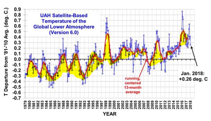

The graph below shows the satellite lower troposphere temperature anomaly from inception through January 2018, as prepared by Drs. Roy Spencer and John Christy of the University of Alabama – Huntsville (UAH).

The graph has been highlighted to illustrate the numerous instances of natural variation in the running average temperature anomaly record. The instances of natural variation in the monthly anomalies are both more numerous and more rapid than those shown in the running average. These instances of natural variation are larger and more rapid than the longer term positive variation in the anomaly record, some or all of which is alleged to be anthropogenic.
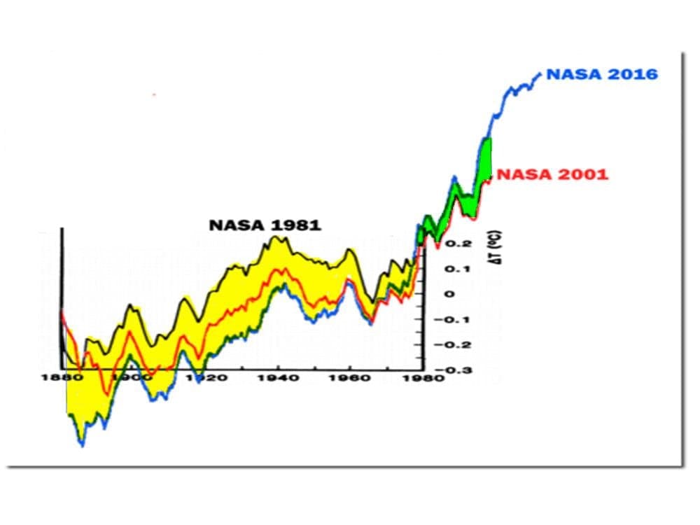
The graph below shows the NASA GISS near-surface temperature anomaly from inception through the end years shown for the three anomaly plots graphed. Note that the three anomaly plots shown in the graph are based on the same temperature data through 1981; and that the red and blue plots are based on the same data through 2001. Clearly, there are numerous incidences of natural variation evident in each of the three anomaly plots, although they do not appear to be as dramatic as in the graph above because of the longer time frame and larger anomaly range displayed.
The graph below displays two instances of unnatural variation in the anomaly record; that is, variation resulting from anthropogenic “adjustments” to, or “re-analysis” of, the global temperature record made by NASA GISS. The climate over the period from 1880 to 1980 and its actual anomaly from the reference period did not change. However, the reported anomaly over the period did change. The anomaly was reduced by as much as ~0.2oC early in the period, thus increasing the apparent rate of change of the anomaly over the period, as shown in the area highlighted in yellow in the graph. The climate over the period from 1980 to 2001 and its actual anomaly from the reference period also did not change. However, the reported anomaly over the period did change. The anomaly was increased by as much as 0.2oC late in the period, as shown in the area highlighted in green in the graph, again increasing the apparent rate of increase of the anomaly over the period. We cannot determine from the information in the graph the number of times the anomalies were “adjusted” or “re-analyzed”. We can only determine the cumulative effects of the “adjustments” or “re-analyses”, which appear to total ~0.4oC, or approximately 1/3 of the reported anomaly change over the entire 136 year period.

We do not know which, if any, of the anomaly plots contained in this graph is accurate. We do know, however, that they cannot all be accurate.
This issue would be far less significant if we were analyzing the results of a controlled experiment which could be rerun after recalibrating the temperature sensors to assure maximum accuracy. However, we are dealing with an ongoing, non-reproducible experiment. The issue would also be far less significant if the expenses of the experiment, or investments which might be made as a result of the experiment, were minimal. However, this ongoing experiment has involved expenses in the billions of dollars; and, the investments to be made as the result of the experiment would be in the tens of trillion of dollars and would affect the lives of billions of people.
This experiment is a vast program, which should not have been begun and should not be pursued with half-vast ideas. We continue to do so at our expense and at our peril.