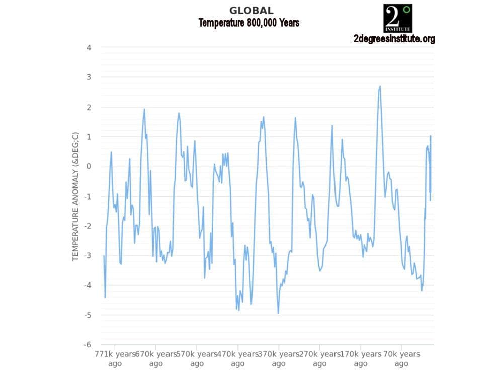


The graph below shows proxy-based global annual temperature anomalies from proxies for the period approximately 800,000 years ago to the present. This graph shows the cyclical nature of global temperatures over the period. The anomalies range from approximately -5° to approximately +2.7°C.The graph below shows proxy-based global annual temperature anomalies from proxies for the period approximately 800,000 years ago to the present. This graph shows the cyclical nature of global temperatures over the period. The anomalies range from approximately -5° to approximately +2.7°C.

The next graph shows global annual temperature anomaly estimates for approximately the past 1000 years. The heavier graph line at the right-hand end of the graph shows instrumental temperature data beginning in about 1880. The January 2021 anomaly is 0.86°C.

The following graph shows the global surface temperature anomaly records produced by Hadley Center, NASA, NOAA, Berkeley Earth and Cowton & Way. Note that the graph lines are nearly identical after about 1970. These anomaly products agree closely with the anomaly shown in the graph above.

The graph below shows the entire history of the UAH satellite temperature anomaly record. This graph displays monthly anomaly values and shows the extremely rapid anomaly changes which occur largely as the result of ENSO events.

The graph below focuses on a very interesting aspect of the temperature anomaly data. It shows that the anomaly trend in the lowest annual minimum temperature anomaly is increasing more than twice as rapidly as the highest annual maximum temperature anomaly. This suggests that the data is affected by the Urban Heat Island (UHI) effect, which causes the high temperature anomaly to be muted by the absorption of heat by urban infrastructure which is then released at night, offsetting a portion of the temperature anomaly drop at night. This characteristic exhibits for each of the countries studied, with the exception of Mexico.

The following graph provides often ignored perspective regarding the increasing temperature anomalies. The orange line is a plot of the increasing temperature in a mid-latitude city. However, while the first four graphs above use compressed y axes to emphasize the increasing temperature anomalies, this graph plots the increasing temperature against a “y” axis which represents the entire range of temperatures experienced in that city, including the record high and record low temperatures. Clearly, the increasing temperature resulting from recent global warming is trivial when viewed from this broader perspective.
The red band on the graph is the typical range of summer daily temperatures in the warmest month of the year, while the blue band is the typical range of daily temperatures in the coldest month of the year. Compared with average daily temperature changes of approximately 20°F throughout the year, an increase in average annual temperature of approximately 1.6°F does not appear to represent a “crisis” compared with a historical range of temperatures of 120+°F, especially when two thirds of the increase is reflected in warmer low temperatures.

It is difficult to imagine reporting either global average temperature or global average temperature anomalies to two decimal place precision when sea surface temperature (71% of earth’s surface area) is not known and the various measures of sea surface temperature display differing rates and directions of change, as shown below.
