
Many members of the consensed climate science community refer to CO2 as the “control knob” of the climate. Some suggest that increased atmospheric CO2 concentrations resulting from human activities are solely responsible for the increase in global average temperatures, as if natural variation had somehow ceased when human emissions of CO2 began to be significant.
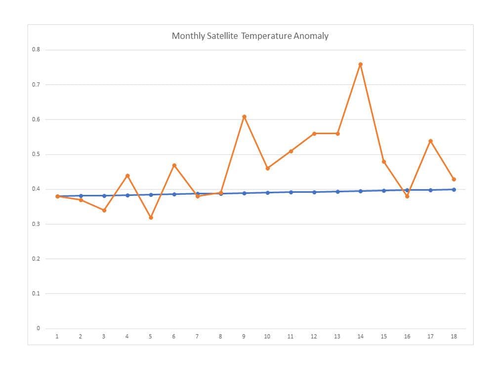
The graph below plots the monthly temperature anomalies reported by the University of Alabama Huntsville for the period January 2019 (Point 1) through June 2020 (Point 18). The blue line is the temperature anomaly which would be expected if there were no natural variation and global temperature anomalies continued to increase at the average rate of increase of temperature over the entire period of the satellite record. The orange line plots the reported temperature anomalies over the same 18-month period.

The long-term rate of increase of the UAH global temperature anomaly is 0.00117° per month (0.14°C per decade divided by 10 years per decade divided by 12 months per year). The rates of change of the global temperature anomaly over the period plotted above range from 0.0 to 0.28°C per month, or up to 239 times the average monthly increase. Clearly, natural climate variation has not ceased.
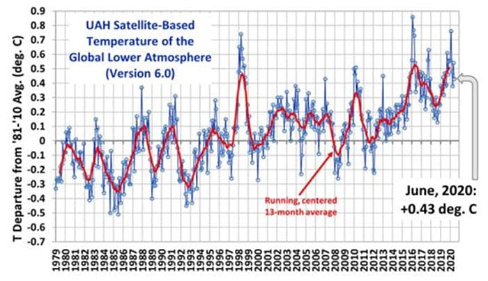
The graph above focuses on the final 18 months of the period shown in the graph below, which shows the anomalies over the entirety of the satellite temperature anomaly record. The diagonal line shown between the endpoints on the graph determines the average temperature anomaly change over the period, 0.14°C per decade. The monthly temperature excursions above and below that line are the result of natural variation. The largest of these excursions are typically associated with El Nino and La Nina events in the Pacific Basin.

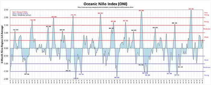
The graph below shows the Oceanic Nino Index for the period 1950 – 2019. The very strong El Nino events in 1982-1983, 1997-1998 and 2015-2016 are clearly visible. The peaks of the 1997-1998 and 2015-2016 events correspond with the highest anomalies shown in the graph above. The strong La Nina events are also clearly visible. There has not been a strong La Nina event since 2010-2011.

These ENSO events are relatively short lived, as shown above. The occurrence and strength of the ENSO events is not predictable, nor is the effect of the phase of the Pacific Decadal Oscillation on the events. The magnitude and speed of the effects of these Pacific Basin events on the global temperature anomaly is an indication of their power compared to the power of increased atmospheric CO2 concentration, which affects the atmosphere of the entire globe.
The large changes in the monthly anomalies caused by the ENSO events emphasizes the significance of the starting and ending points used to analyze global temperature anomaly changes. For example, it is common to use the period 1980-2010 as the climate period of reference. Applying this period to analyze the rate of increase of the global temperature anomaly would result in a much lower rate of increase than the 0.14°C rate reported by UAH.