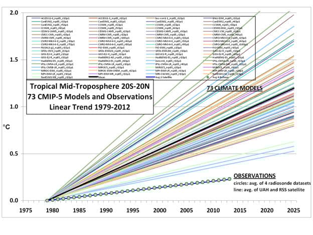
The concerns expressed about future global warming are all based on the outputs of numerous global climate Models (GCMs). The graph below, prepared by Dr. John Christy, illustrates the range of variation of the numerous model outputs, beginning from the end of the historical period over which the models were tuned to temperature observations. The individual graph lines have been linearized to highlight the obvious major differences in their future temperature anomaly projections.
The darkest line on the graph is the mean of the model projections. This model mean is often assumed to have greater significance than the individual model outputs. However, none of the models has been verified, among other reasons because none of the models accurately projects the observed behavior of the climate. While it is possible that one of the models is an accurate model of the climate, it is certain that not more than one of them is accurate and it is highly likely that none of them is an accurate model, based on the progressive divergence between the models and the climate observations over the 30+ year period displayed in the graph. Therefore, the model mean is relatively meaningless.

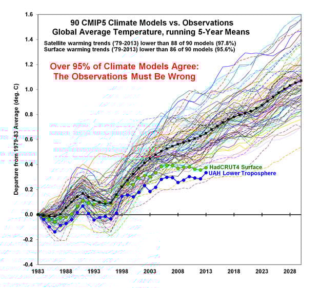
The graph below is a more common presentation of the GCM outputs compared with the HadCRUT 4 near-surface and the UAH lower troposphere temperature anomoly records. This graph and the humorous note in red are the work of Dr. Roy Spencer.

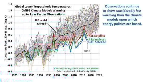
The next graph, prepared by Dr. John Christy, notes that the climate model mean warms more than twice as fast as the observations reported by two satellite analysis teams and by four near-surface data reanalysis efforts.

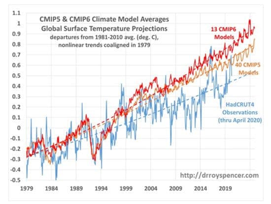
The next graph, prepared by Dr. Roy Spencer, compares the HadCRUT4 observations through April, 2020 with the outputs of 40 of the CMIP5 models and 13 of the new CMIP6 models. Note that the outputs of the CMIP6 models show an even greater departure from the observations than the CMIP5 models.

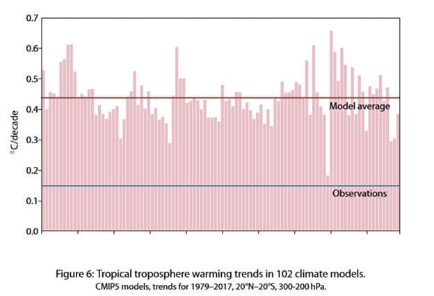
The bar chart below, prepared by Dr. John Christy, compares the warming trends produced by 102 climate models and the model average with the observations over the same period. Note that the model average trend is nearly 3 times the trend in the observations.

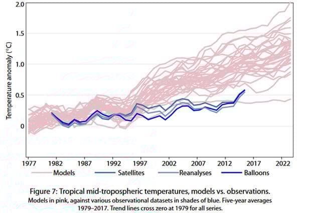
The graph below, also by Dr. Christy, illustrates the close correspondence of the satellite, weather balloon and near-surface reanalyses and the models divergence from these observations, with the exception of a single model developed by a group of Russian scientists.

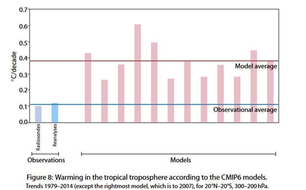
The graph below by Dr. Christy compares the observational average with the available subset of the CMIP6 models, again showing a temperature anomaly trend three times greater than the observed trend.

The GCMs rely on a thermodynamic model of the atmosphere like the simplified model shown here, or the more complex model shown here.
The graphs above clearly illustrate that the science regarding future climate change is hardly settled and that the current climate models clearly do not accurately model the real climate.