
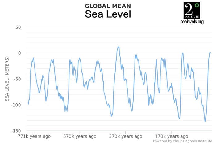
The graph below plots global sea level over the past approximately 800,000 years. Note the cyclical nature of sea level over that period. Sea level ranges from a high of +11 meters to a low of -133 meters. The low levels are associated with ice ages.

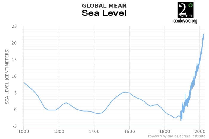
The graph below plots global sea level over the past approximately 1000 years. The heavier graph line beginning in approximately 1890 is instrumental data, as opposed to the proxies prior to then. The instrumental data ranges from a low of -2.2 centimeters to +22.4 centimeters. Note that the y-axis in this graph is units of centimeters rather than meters in the graph above. Note also that current sea levels are 10.8 meters lower than the peak level approximately 400,000 years ago.

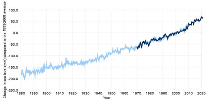
The graph below plots the sea level rise since 1880 in millimeters. The total sea level rise over the period is approximately 265 millimeters, or approximately 1.7 millimeters per year. The dark line overlaying the light blue line in the graph plots sea level rise as measured by satellite, while the light blue line is measurements taken by tide gauges.

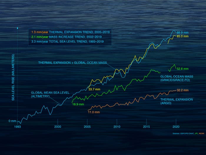
The graph below estimates the effects of the factors which contribute to sea level rise. The satellite data computes an annual sea level rise of approximately 3.3 millimeters per year since the data became available in 1993, or nearly twice the rate of rise measured by the tide gauges. This is a very significant difference which remains unresolved.

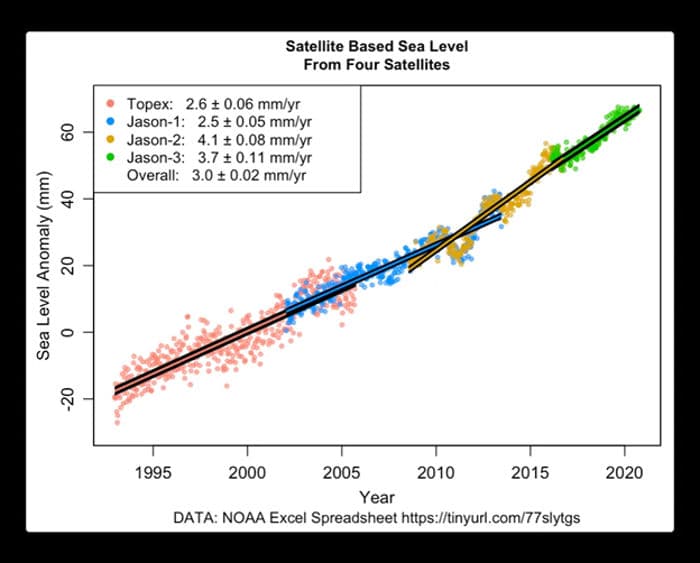
However, the graph above contains data from four different satellites, but does not identify the period over which each satellite provided the data, nor does it differentiate the rates of sea level rise provided by each satellite. The graph below prepared by Willis Eschenbach provides this information.

Note that the rates of rise measured by the two earlier satellites are essentially identical, while the two later satellites differ significantly both from the earlier satellites and from each other. It is not yet clear whether the higher rates measured by the more recent satellites reflect a real acceleration in the rate of sea level rise. Regardless, combining the measurements from the four different satellites into a composite graph with an average rate of rise is poor practice.
Global sea level rise is a very difficult phenomenon to measure. Tide gauges are located sparsely along global shorelines. Many of the locations of the tide gauges are subject to subsidence due to erosion, ground water extraction or mineral production. Other locations remain subject to geostatic rebound following the compression imposed by the last ice age. Finally, the seas are never at rest, but rather are subject to tides and to wind-driven ripples, swells and waves as well as thunderstorms and tropical cyclones.