

“Signal-to-noise ratio (abbreviated SNR or S/N) is a measure used in science and engineering that compares the level of a desired signal to the level of background noise.”, everything.explained.today
One of the primary focuses of climate science is the change in global near-surface temperature, particularly the changing anomaly between current global near-surface temperature and the average global near-surface temperature during a reference climate period.

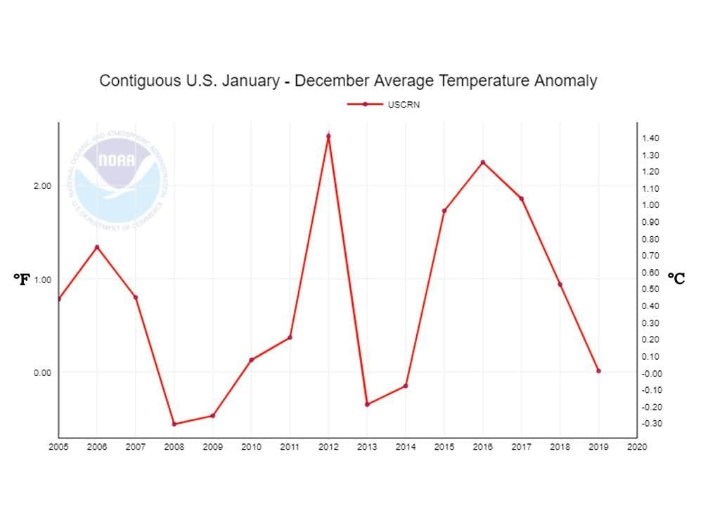
The graph above shows the annual average near-surface temperature for the contiguous United States, as measured by the US CRN weather stations, over the entire period of operation of the CRN through 2018. The “signal” climatologists are seeking is the long-term average rate of increase of near-surface temperature, or the long-term average rate of increase of the anomaly relative to the climate reference period. In the graph above, the increase in the annual anomaly over the 14-year period from 2005-2018 appears to be approximately 0.1°C, or 0.07°C per decade.
In this graph, the individual annual anomalies vary over a range of approximately 1.7°C, or approximately 17 times total change in the average anomaly over the period of operation of the US CRN. The rate of change of the annual average anomalies varies from approximately 0.1°C per year to approximately 1.6°C per year. This is the “noise” from which the long-term anomaly “signal” must be distinguished. This represents a formidably low “signal” to “noise” ratio.

The graph above, also from NOAA, shows the monthly anomaly values for the entire period of operation of the US CRN through July 2019. This graph also includes a plotted trend line for the period, showing an increase of approximately 0.5°C over the 14.5-year period. This is a significantly higher rate of increase than is indicated by the annual average values in the previous graph. Note also the extent to which annual averaging diminishes the relative magnitude of the “noise”; and, that the rate of change of the monthly anomalies ranges up to 4°C per month.

The graph above displays the annual average anomalies for the contiguous US over the period from 1988 through 2018. The anomalies for the period from 1988 through 2005 are from the US Historical Climatology Network, which are also shown overlaid on the US CRN values for the period 2005-2012. The total annual anomalies vary over a range of approximately 2.2°C. In the graph above, the increase in the annual anomaly over the 30-year period appears to be approximately 0.7°C, or approximately 0.23°C per decade. This is approximately 3 times the rate of increase over the final 14 years of the period.
These differences highlight the importance of the period selected for analysis, especially in a situation in which the “signal” to “noise” ratio is substantially less than 1. It is also important to note that the US CRN values are unadjusted, while the US HCN values are “adjusted” in an attempt to correct biases and errors in the raw data. It is reasonable to assume that the close match between the US CRN values and the US HCN values over the period of overlap from 2005-2012 is the result of “adjustments” to the US HCN data.
The magnitude of the anomaly variations (“noise”) over the period relative to the magnitude of the warming ”signal” is a clear illustration of the effects of natural variations in the earth’s weather relative to the magnitude of the “forced” climate warming.