Call or complete the form to contact us for details and to book directly with us
435-425-3414
435-691-4384
888-854-5871 (Toll-free USA)


Contact Owner

*Name
*Email
Phone
Comment
 
Skip to Primary Navigation Skip to Primary Content Skip to Footer Navigation
▽ Explore More ▽ Hide

Climate and Climate Change

Climate and Climate Change

Climate Change

Two days before Halloween, 2011, New England was struck by a freak winter storm. Heavy snow descended onto trees covered with leaves.  Overloaded branches fell on power lines.  Blue flashes of light in the sky indicated exploding transformers.  Electricity was out for days in some areas and for weeks in others. Damage to property and disruption of lives was widespread.

That disastrous restriction on human energy supplies was produced by Nature.  However, current and future energy curtailments are being forced on the populace by Federal policies in the name of dangerous “climate change/global warming”.  Yet, despite the contradictions between what people are being told and what people have seen and can see about the weather and about the climate, they continue to be effectively steered away from the knowledge of such contradictions to focus on the claimed disaster effects of  “climate change/global warming” (AGW, “Anthropogenic Global Warming”). 

People are seldom told HOW MUCH is the increase of temperatures or that there has been no increase in globally averaged temperature for over 18 years.  They are seldom told how miniscule is that increase compared to swings in daily temperatures. They are seldom told about the dangerous effects of government policies on their supply of “base load” energy — the uninterrupted energy that citizens depend on 24/7 — or about the consequences of forced curtailment of industry-wide energy production with its hindrance of production of their and their family’s food, shelter, and clothing. People are, in essence, kept mostly ignorant about the OTHER SIDE of the AGW debate.

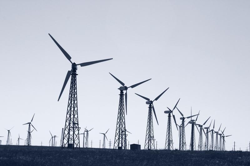
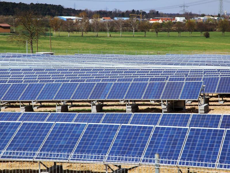
Major scientific organizations — once devoted to the consistent pursuit of understanding the natural world — have compromised their integrity and diverted membership dues in support of some administrators’ AGW agenda.   Schools throughout the United States continue to engage in relentless AGW indoctrination of  students, from kindergarten through university.  Governments worldwide have been appropriating vast sums for “scientific” research, attempting to convince the populace that the use of fossil fuels must be severely curtailed to “save the planet.”  Prominent businesses — in league with various politicians who pour ever more citizen earnings into schemes such as ethanol in gasoline, solar panels, and wind turbines — continue to tilt against imaginary threats of AGW.  And even religious leaders and organizations have joined in to proclaim such threats.   As a consequence, AGW propaganda is proving to be an extraordinary vehicle for the exponential expansion of government power over the lives of its citizens. 

Reasoning is hindered by minds frequently in a state of alarm.  The object of this website is an attempt to promote a reasoned approach; to let people know of issues pertaining to the other side of the AGW issue and the ways in which it conflicts with the widespread side of AGW alarm (AGWA, for short).  In that way it is hoped that all members of society can make informed decisions.

Highlighted Article: Climate ‘Emergency’? Not So Fast

  • 5/6/21 at 03:00 AM


From: National Review

By: Richard Lindzen & William Happer

Date: April 16, 2021


Climate ‘Emergency’? Not So Fast


Americans should not be stampeded into a disastrous climate crusade.

"By obligating the United States once more to the Paris agreement, and by signaling very clearly that “climate” will be central to its policies, the Biden administration has joined other governments in the crusade against a supposed “climate emergency.” We use the word “crusade” advisedly, since the frenzy over climate resembles the medieval crusades against foreign infidels and home-grown heretics. There is even a children’s climate crusade.

Medieval crusaders would chant Deus Vult, or “God wants it” — the ultimate virtue-signaling slogan. Few leaders of medieval Europe could resist the temptation to join the crusades. The medieval elite could count on earthly rewards to add to their heavenly treasures. The enemies of God — and the little people — paid the bills.

Some climate crusaders have invoked the mandate of heaven, and others use language all too reminiscent of millenarianism. But most claim to be following a mandate of science." ...


Climate ‘Emergency’? Not So Fast


Tags: Highlighted Article

Temperature Variability 2

The “Climate Crisis”, or “Climate Emergency”, or climate “Existential Threat” is an international political construct based on the projections of an ensemble of numerous, unverified climate models run with ranges of input factors, since the actual values of these input factors are unknown. The perception of crisis is a creature of political science, not hard science.

The principal factor on which the concern is focused is a reported increase in global average temperature of 1°C over the 120 year period since 1900 and the potential global adverse impacts of another 0.5-1.0°C increase beyond current levels over some undefined future period.

Very little effort has been put forth by the consensed climate science community to provide perspective regarding the current and projected future temperature increases. However, Dr. Richard Lindzen recently made a presentation on “The Imaginary Climate Crisis” in which he included the following graph focused on placing the purported temperature change in perspective. The graph shows the magnitude of regular, shorter term temperature changes in fourteen cities in the contiguous United States. Analysis of the same temperature changes in other cities globally would produce differing numbers but display the same general patterns.


Temperature Changes People Know How To Handle


The first segment on the horizontal axis shows the global average temperature anomaly over the period 1900-2020 as approximately 1°C.

The second segment on the horizontal axis shows the individual city and average temperature change which commonly occurs in these cities over the two-hour period from 8 am to 10 am on any given day, which ranges from approximately 1-5°C, or up to 5 times the global average temperature increase over the past 120 years of concern to global politicians.

The third segment on the horizontal axis shows the typical “sunrise to afternoon” temperature change in these cities on any given day, which ranges from approximately 7-17°C, or 7-17 times the global average temperature increase over the past 120 years.

The fourth segment on the horizontal axis shows the typical difference between the January average temperature and the July average temperature in each of the cities, which ranges from approximately 9-28°C, or 9-28 times the global average temperature increase of concern to climate alarmist politicians.

The fifth segment on the horizontal axis shows the typical temperature difference between a January morning and a July afternoon in each city, which ranges from approximately 18-40°C over the six month period, or 18-40 times the temperature increase of concern to climate alarmist politicians.

The sixth segment on the horizontal axis shows the typical temperature difference between the yearly average hottest and coldest temperature in each of the cities, which ranges from approximately 30-60°C over the average year, or 30-60 times the temperature increase of concern.

The seventh segment on the horizontal axis shows the temperature difference between the warmest and the coldest temperatures ever recorded for each of the cities, which ranges from approximately 38-75°C, or 38-75 times the maximum temperature difference of record.

Clearly, the reported global annual average temperature increase typically attributed to increased atmospheric CO2 concentrations pales in comparison to typical hourly, daily and seasonal temperature changes and to the record temperature difference for each city. Also, since approximately 60% of the reported global annual average near-surface temperature increase is an increase in the nightly low temperature while only approximately 40% is an increase in the daily high temperature, it seems unlikely that people would be unable to handle the future temperature increases of concern to climate alarmists.


Tags: Temperature Record, Temperature Anomaly, Global Temperature

Highlighted Article: How we fool ourselves. Part II: Scientific consensus building

  • 4/29/21 at 03:00 AM


From: Climate Etc.

By: Judith Curry

Date: April 10, 2021


How we fool ourselves. Part II: Scientific consensus building


“Like a magnetic field that pulls iron filings into alignment, a powerful cultural belief is aligning multiple sources of scientific bias in the same direction. – policy scientist Daniel Sarewitz

Statistician Regina Nuzzo summarizes the problem:

“This is the big problem in science that no one is talking about: even an honest person is a master of self-deception. In today’s environment, our talent for jumping to conclusions makes it all too easy to find false patterns in randomness, to ignore alternative explanations for a result or to accept ‘reasonable’ outcomes without question — that is, to ceaselessly lead ourselves astray without realizing it.”

Psychologists Richard Simmons et al. find that researcher bias can have a profound influence on the outcome of a study. Such ‘researcher degrees of freedom’ include choices about which variables to include, which data to include, which comparisons to make, and which analysis methods to use. Each of these choices may be reasonable, but when added together they allow for researchers to extract statistical significance or other meaningful information out of almost any data set. Researchers making necessary choices about data collection and analysis believe that they are making the correct, or at least reasonable, choices. But their bias will influence those choices in ways that researchers may not be aware of. Further, researchers may simply be using the techniques that work – meaning they give the results the researcher wants.

The objective of scientific research is to find out what is really true, not just verify our biases. If a community of scientists has a diversity of perspectives and different biases, then the checks and balances in the scientific process including peer review will eventually counter the biases of individuals. Sometimes this is true—but often this does not happen quickly or smoothly. Not only can poor data and wrong ideas survive, but good ideas can be suppressed.


How we fool ourselves. Part II: Scientific consensus building


Tags: Highlighted Article

Temperature Variability

The consensed climate science community has argued that previous climate warming and cooling events were the result of natural variability, but that the recent warming is the result of increased anthropogenic CO2 concentrations in the atmosphere. They provide no support for the idea that natural variability has ceased, or at least greatly diminished, nor do they provide any proof that the recent warming is CO2 driven.

The graph below illustrates the measure US average temperature anomaly over the period 1880-2020. The temperature trend in the data corresponds to the ~1°C increase in the global average temperature anomaly over the same period, suggesting that the US has experienced average warming very similar to the global average warming.


Contiguous U.S. Average Temperature Anomaly


The year 1950 is the year typically associated with the global warming driven by increasing anthropogenic CO2 concentrations. However, the trend in the anomaly data graphed above shows a temperature anomaly decline over the period from 1940-1970, followed by a temperature anomaly increase from 1970-2020. Note that the data graphed in blue above, from the US Historical Climatology Network, has been “adjusted”, while the data graphed in red, from the US Climate reference Network, is unadjusted or raw data. The USCRN uses remotely located, high accuracy and high precision measuring instruments, which are cross calibrated to detect instrument drift or failure.

The “adjusted” USHCN anomaly data match the unadjusted USCRN anomaly data over the period when the plotted data overlap. However, the earlier USHCN anomaly data have been affected by “unnatural variation”, as shown in the graph below produced by Tony Heller.


USHCN TMAX Vs. Year 1918-2019


Note that the overall magnitude of the “adjustments” over the period shown is approximately 1.5°F (~1°C), or approximately all the recent warming attributed to increased atmospheric CO2 concentrations. The “adjustments” primarily cool the past, prior to the existence of the USCRN, which provides a high accuracy, high precision reference in the period after 2005 for the US anomaly data. The “adjustments” make the rate of increase of the temperature anomaly appear to be larger and essentially reverse the cooling trend apparent in the measured data. There is no global reference to constrain the “adjustments to non-US data and no possible reference for anomalies “infilled” where no data exists.

The first graph above clearly illustrates the magnitude of natural variability in the temperature anomalies, which ranges from approximately +4.2°C to -5.5°C, or approximately ten times the trend of the warming anomalies over the period. These anomalies do not include any seasonality, since the anomalies are the deviation from the same months in the 30-year climate reference period.

The variation in the anomalies is largely driven by longer term weather events, such as El Nino and La Nina, and by climate events such as the Pacific Decadal Oscillation and the Atlantic Multidecadal Oscillation.
The fact that global temperature anomaly data have been subjected to “adjustment” over a period of more than 100 years raises serious questions about the validity of the reported warming anomaly and the entire anthropogenic climate change narrative.


Tags: Temperature Anomaly

Highlighted Article: Cities, countries, and economies were built with derivatives from oil, not by electricity

  • 4/22/21 at 03:00 AM


From: CFACT

By: Ronald Stein

Date: April 8, 2021


Cities, countries, and economies were built with derivatives from oil, not by electricity


"Before world leaders move too fast to consummate their climate policies, they need to be cognizant of two “aha” moments: 1) wind and solar can only generate intermittent electricity, and 2) electricity cannot manufacture the oil derivatives that are the basis of the thousands of products that have built the world’s cities, countries, and economies over the last 200 years.

Can you imagine primitive man with an abundance of wind and solar electricity and nothing to power! Imagine living with Just GREEN Electricity.

Interestingly, for more than two centuries the most important benefits to humanity from fossil fuels is the oil derivatives, that electricity CANNOT provide, and NOT the fuels that can be manufactured for the transportation and military infrastructures.

The world has had more than 200 years to develop clones or generics to replace the crude oil derivatives that are the foundation of all the products demanded by lifestyles and economies around the world. Wind and solar are not only incapable of manufacturing any such derivatives, but the manufacturing of wind and solar components are themselves 100 percent dependent on the derivatives made from crude oil.

Ever since the beginning of manufacturing and assembly of cars, trucks, airplanes, and military equipment in the early 1900’s, and the discovery of the versatility of products that could be made from petroleum derivatives, the world has had almost 200 years to develop clones or generics to replace the crude oil derivatives that account for more than 6,000 products that are the basis of lifestyles and economies of the healthier and wealthier countries around the world." ...


Cities, countries, and economies were built with derivatives from oil, not by electricity


Tags: Highlighted Article

Weather Events

There is a strong and growing effort to attribute individual weather events and changes in the frequency and intensity of individual weather events to climate change. Dr. Roger Pielke, Jr., Bjorn Lomborg, Dr. Joseph D’Aleo and others have published numerous essays disputing these efforts. The graphs developed by these authors and others have been assembled into a new book, IMPACTS OF CLIMATE CHANGE,PERCEPTION AND REALITY  by Dr. Indur M. Goklany.

Heat waves, at least in the US, where longer term data are available, have declined significantly.


Heatwaves for the USA


Tropical cyclones have decreased in total numbers, though there is no trend in the number of major tropical cyclones.


Hurricanes landfalling in the continental USA, 1851-2018


There is also no obvious trend in the Accumulated Cyclone Energy, the combination of event frequency and intensity.


Global and northern hemisphere ACE


Strong tornados have also declined in frequency, though total reported tornadoes have increased as the result of satellite observations detecting smaller tornadoes which might otherwise not have been detected or reported.


Strong Tornados in the USA, 1950-2017


Droughts are also decreasing slightly, though there is large year-to-year variability.


Drought as measured by Palmer Z-index for the contiguous US, 1895-2019

Global drought 1950-2018


Annual death rates from extreme weather events have decreased dramatically, largely as the result of improved prediction and communication as well as efforts at adaptation.


Average annual deaths and death rates from all EWEs, 1900-2018


Cold weather events continue to be a far greater cause of death than warm weather events worldwide.


Ratio of deaths attributable to colder-than-optimum vs those attributable to warmer-than-optimum temperatures


Global economic losses resulting from severe weather events continue to decline as a percentage of global GDP. The total loss from these events continues to grow, however, as increased infrastructure investments are made in areas of known weather risk.


Global weather losses as percent of global GDP, 1990-2018


Areas destroyed by wildfires continue decline, even in the face of continued poor forest management practices.


Area burned by wildfire, US, 1926-2017


Crop yields and food supply have continued to increase as the result of a number of factors including improved farming practices, the broader availability of synthetic fertilizers and the effects of CO2 fertilization.


Improving food situation since 1961


Finally, deaths attributable to climate catastrophes declined precipitously until the 1970s and continue to decline, largely as the result of improved weather prediction and notification systems and adaptation efforts.


Deaths from Climate and non-Climate Catastrophes, 1920-2017


The above suggests that climate change is not causing or adversely affecting extreme weather events or exacerbating their results. It certainly belies the claims of “climate crisis”, “climate emergency” and “existential threat”.


Tags: Severe Weather

Highlighted Article: The Imaginary Climate Crisis: How can we Change the Message? A talk by Richard Lindzen

  • 4/15/21 at 08:28 AM

From: Clintel.org

Date: April 5, 2021


The Imaginary Climate Crisis: How can we Change the Message? A talk by Richard Lindzen


"The Irish Climate Science Forum (ICSF) in cooperation with CLINTEL hosted a lecture by the world-renowned climate scientist Richard Lindzen. The online lecture was attended by around 200 people from around the world (including a group of climate activists who disturbed the talk. The recorded talk can be viewed here.

Professor Lindzen kindly agreed that his written speech could be posted here at CLINTEL. It follows below.


Richard S. Lindzen, Professor Emeritus of Atmospheric Sciences, MIT

For about 33 years, many of us have been battling against climate hysteria. We have correctly noted

The exaggerated sensitivity,
The role of other processes and natural internal variability,
The inconsistency with the paleoclimate record,
The absence of evidence for increased extremes, hurricanes, etc. and so on.

We have also pointed out the very real benefits of CO2 and even of modest warming. And, as concerns government policies, we have been pretty ineffective. Indeed our efforts have done little other than to show (incorrectly) that we take the threat scenario seriously. In this talk, I want to make a tentative analysis of our failure.

In punching away at the clear shortcomings of the narrative of climate alarm, we have, perhaps, missed the most serious shortcoming: namely, that the whole narrative is pretty absurd. Of course, many people (though by no means all) have great difficulty entertaining this possibility. They can’t believe that something so absurd could gain such universal acceptance. Consider the following situation. Your physician declares that your complete physical will consist in simply taking your temperature. This would immediately suggest something wrong with your physician. He further claims that if your temperature is 37.3C rather than between 36.1C and 37.2C you must be put on life support. Now you know he is certifiably insane. The same situation for climate (a comparably complex system with a much more poorly defined index, globally averaged temperature anomaly) is considered ‘settled science.’"...


The Imaginary Climate Crisis: How can we Change the Message? A talk by Richard Lindzen


Tags: Highlighted Article

Climate Models

The concerns expressed about future global warming are all based on the outputs of numerous global climate Models (GCMs). The graph below, prepared by Dr. John Christy, illustrates the range of variation of the numerous model outputs, beginning from the end of the historical period over which the models were tuned to temperature observations. The individual graph lines have been linearized to highlight the obvious major differences in their future temperature anomaly projections.

The darkest line on the graph is the mean of the model projections. This model mean is often assumed to have greater significance than the individual model outputs. However, none of the models has been verified, among other reasons because none of the models accurately projects the observed behavior of the climate. While it is possible that one of the models is an accurate model of the climate, it is certain that not more than one of them is accurate and it is highly likely that none of them is an accurate model, based on the progressive divergence between the models and the climate observations over the 30+ year period displayed in the graph. Therefore, the model mean is relatively meaningless.


Tropical Min-Troposphere 20S-20N 73 CMIP-5 Models and Observations Linear Trend 1979-2012

The graph below is a more common presentation of the GCM outputs compared with the HadCRUT 4 near-surface and the UAH lower troposphere temperature anomoly records. This graph and the humorous note in red are the work of Dr. Roy Spencer.


90 CMIP5 Climate Models vs. Observations

The next graph, prepared by  Dr. John Christy, notes that the climate model mean warms more than twice as fast as the observations reported by two satellite analysis teams and by four near-surface data reanalysis efforts.


Global Lower Tropospheric Temeratures: CMIP5 Climate Models Warming uo to 2x as Fast as Observations

The next graph, prepared by Dr. Roy Spencer, compares the HadCRUT4 observations through April, 2020 with the outputs of 40 of the CMIP5 models and 13 of the new CMIP6 models. Note that the outputs of the CMIP6 models show an even greater departure from the observations than the CMIP5 models.


CMIP5 & CMIP6 Climate Model Averages


The bar chart below, prepared by Dr. John Christy, compares the warming trends produced by 102 climate models and the model average with the observations over the same period. Note that the model average trend is nearly 3 times the trend in the observations.


102 Climate Model Projections & Averages vs. Observations


The graph below, also by Dr. Christy, illustrates the close correspondence of the satellite, weather balloon and near-surface reanalyses and the models divergence from these observations, with the exception of a single model developed by a group of Russian scientists.


correspondence of the satellite, weather balloon and near-surface reanalyses and the models divergence


The graph below by Dr. Christy compares the observational average with the available subset of the CMIP6 models, again showing a temperature anomaly trend three times greater than the observed trend.


observational average with the available subset of the CMIP6 models


The GCMs rely on a thermodynamic model of the atmosphere like the simplified model shown here, or the more complex model shown here.

The graphs above clearly illustrate that the science regarding future climate change is hardly settled and that the current climate models clearly do not accurately model the real climate.


Tags: Climate Models

Highlighted Article: Dangerously Stupid Science: Solar Geoengineering

  • 4/8/21 at 03:00 AM


From: Watts Up With That

By: Jim Steele

Date: April 6, 2021


Dangerously Stupid Science: Solar Geoengineering


"A new report from the National Academies of Sciences recommended the United States pursue a robust research program into solar geoengineering, to reflect sunlight and forestall some of the worst effects of global warming.  Seeking $200 million over 5 years for research from the Biden administration, those scientists push a climate crisis narrative, arguing greenhouse gas emissions are not falling quickly enough and, “Without decisive action and rapid stabilization of global temperature, risks from a changing climate will increase in the future, with potentially catastrophic consequences” This should alarm everyone. Not because a climate crisis is real, but because solar geoengineering is the height of stupidity and truly endangers humanity. Still solar blocking experiments were planned for June 2021 in Sweden. Fortunately objections from other scientists, environmentalists, and Indigenous groups just cancelled those plans … for now."


Dangerously Stupid Science: Solar Geoengineering


Tags: Highlighted Article

Highlighted Article: Climate Dynamics: The True Control Knob of Climate Change

  • 4/1/21 at 03:00 AM


From: Watts Up With That

By: Jim Steele

Date: March 27, 2021


Climate Dynamics: The True Control Knob of Climate Change


"The earth’s energy equilibrium is determined by the balance between incoming solar radiation versus radiative cooling that emits infrared radiation back to space. Water vapor primarily and CO2 can slow radiative cooling via the greenhouse effect. I am most grateful for the greenhouse effect. Without it the earth’s average temperature would hover near 0°F instead of our currently more livable 59°F. But in addition to any radiative effects, the earth’s global average temperature is determined by a variety of climate dynamics, such as the balance between ocean heat storage and heat ventilation. This is well established as climate scientists attributed the slowdown in 21st century global warming was due to increased ocean heat storage associated with a period of more La Ninas. Warming in the northeast Pacific Ocean, famously known as the blob, was not caused by added heat, but by reduced winds that ventilated less heat than normal. Cloud dynamics are also important. Clouds can warm the nights and cool the days." ...


Climate Dynamics: The True Control Knob of Climate Change


Tags: Highlighted Article

Temperature Graphs


The graph below shows proxy-based global annual temperature anomalies from proxies for the period approximately 800,000 years ago to the present. This graph shows the cyclical nature of global temperatures over the period. The anomalies range from approximately -5° to approximately +2.7°C.The graph below shows proxy-based global annual temperature anomalies from proxies for the period approximately 800,000 years ago to the present. This graph shows the cyclical nature of global temperatures over the period. The anomalies range from approximately -5° to approximately +2.7°C.


Global Temperature 800,000 years


The next graph shows global annual temperature anomaly estimates for approximately the past 1000 years. The heavier graph line at the right-hand end of the graph shows instrumental temperature data beginning in about 1880. The January 2021 anomaly is 0.86°C.


Global Temperature 1000 years


The following graph shows the global surface temperature anomaly records produced by Hadley Center, NASA, NOAA, Berkeley Earth and Cowton & Way. Note that the graph lines are nearly identical after about 1970. These anomaly products agree closely with the anomaly shown in the graph above.


Global Temperature 1850-2019


The graph below shows the entire history of the UAH satellite temperature anomaly record. This graph displays monthly anomaly values and shows the extremely rapid anomaly changes which occur largely as the result of ENSO events.


Temperature UAH Satellite Jan 2021


The graph below focuses on a very interesting aspect of the temperature anomaly data. It shows that the anomaly trend in the lowest annual minimum temperature anomaly is increasing more than twice as rapidly as the highest annual maximum temperature anomaly. This suggests that the data is affected by the Urban Heat Island (UHI) effect, which causes the high temperature anomaly to be muted by the absorption of heat by urban infrastructure which is then released at night, offsetting a portion of the temperature anomaly drop at night. This characteristic exhibits for each of the countries studied, with the exception of Mexico.


Temperature Anomalies and Extremes 1900-2012


The following graph provides often ignored perspective regarding the increasing temperature anomalies. The orange line is a plot of the increasing temperature in a mid-latitude city. However, while the first four graphs above use compressed y axes to emphasize the increasing temperature anomalies, this graph plots the increasing temperature against a “y” axis which represents the entire range of temperatures experienced in that city, including the record high and record low temperatures. Clearly, the increasing temperature resulting from recent global warming is trivial when viewed from this broader perspective.

The red band on the graph is the typical range of summer daily temperatures in the warmest month of the year, while the blue band is the typical range of daily temperatures in the coldest month of the year. Compared with average daily temperature changes of approximately 20°F throughout the year, an increase in average annual temperature of approximately 1.6°F does not appear to represent a “crisis” compared with a historical range of temperatures of 120+°F, especially when two thirds of the increase is reflected in warmer low temperatures.


Temperature-Average Annual Global 1880-2015


It is difficult to imagine reporting either global average temperature or global average temperature anomalies to two decimal place precision when sea surface temperature (71% of earth’s surface area) is not known and the various measures of sea surface temperature display differing rates and directions of change, as shown below.


Temperature-Mixed Layer or SST 2000-2019


Tags: Global Temperature, Temperature Record, Temperature Anomaly

CO2 Graphs

The graphs below show atmospheric CO2 levels over the past 800,000 years and the past 1020 years. The longer term graph illustrates the cyclical nature of atmospheric CO2 concentrations, varying from a low of approximately 173 ppm to a high of approximately 300 ppm until very recently. The shorter term graph shows the more rapid rise, beginning in approximately 1910. The heavier graph line beginning in approximately 1960 shows the instrumented data from the Mauna Loa Observatory in Hawaii. The earlier period concentrations in the graph are based on proxies.


Global CO2 Levels 800000 years


Global CO2 Levels 1000 years


The next graph shows measured data collected in Europe from 1800 until 1960, when the Mauna Loa data became available. This graph clearly shows CO2 concentrations above current levels during the period from approximately 1800 until 1825. These measurements were performed by chemical analysis and their accuracy is disputed, though they should have better resolution than the proxy data shown in the graphs above.


CO2 Levels 1800-1960


The following graph displays the Mauna Loa data beginning just prior to 1960. This data clearly shows the changes in CO2 concentration on a seasonal basis, as well as the longer-term increase to approximately 415 ppm through 2020.


CO2 Levels Mauna Loa

Atmospheric CO2 concentration is considered important by the consensed climate science community, many of whom believe it is the “control knob” for global temperatures. However, as shown in the graph below, the effect of incremental CO2 in the atmosphere decreases logarithmically as the concentration increases.


This result was recently confirmed as the result of research by Happer and Wijngaarden, who studied the infrared absorption spectra for CO2 spectral line by spectral line. They concluded that the absorption potential of CO2 in the atmosphere is virtually ”saturated”, in the sense that additional CO2 would produce virtually no additional warming.


CO2 Heating Effect


The results of the Happer and Wijngaarden study are consistent with the numerous research results shown in the graph below, which suggest that the sensitivity of the climate to additional CO2 is at or below the low end of the range of sensitivities assumed by the IPCC.

It is clear from the graphs above that atmospheric CO2 concentrations have increased in the period since about 1950. Global annual CO2 emissions continue to increase, driven largely by increasing fossil energy consumption in the developing nations of Asia and Africa. However, the research of Happer and Winjgaarden suggests that this increase should have minimal effect on atmospheric heating and global temperatures.


Tags: CO2 Emissions

Highlighted Article: The Water Planet Earth And Its Climate

  • 3/18/21 at 03:00 AM


From: Watts Up With That

By: Boris Winterhalter

Date: March 16, 2021


The Water Planet Earth And Its Climate


Introduction

Many years ago I happened to read a paper by Willis Eschenbach introducing his Water Thermostat. I have forgotten the essence of his paper, but the name stuck with me for years. Now years later and having retired from my normal marine geological activity at the Geological Survey of Finland in 2002, I have been able to dig deeper into the IPCC storyline of manmade global warming. The fact is that my view of the story does not meet ends with the official IPCC storyline where carbon dioxide, instead of being the source of life, is assumed to be the master culprit behind the slight warming of our planet for example since the end of the Little Ice Age 150 years ago. It is said that the warming is caused by the fast developing industrial revolution, luckily learning to exploit fossil fuels, and thus improving human living standards.

Yes! Carbon dioxide has been coined as an evil gas, a pollutant by the US Environ-mental Protection Agency (EPA), warming the atmosphere to catastrophic levels, inducing floods, droughts, super hurricanes and even the “end of humanity”? The ghastly thing is that the IPCC climate narratives have been successfully targeted to scare people in all parts of our wonderful planet with imminent danger due to increasing levels of emissions of CO2 which, as I mentioned above, is in reality, together with water, simply the “must food” for plants, thus also for all life on Earth.

I should point out that from the first IPCC climate assessment report published in 1990, the scare tactics in all four IPCC follow-up reports up to the fifth AR5 WGI science basis report, the scare propaganda has every time intensified. Probably the 6th report, soon to be published, will be close to doomsday propaganda.

In my talk I will try to paint a picture of our planet and how come it has been able to sustain vivid life forms for over half a billion years and this I will do without those complex climate models assumed to be able to mimic nature. But before that, there was recently this interesting link by Professor Toby Tyrrell: https://inews.co.uk/news/planet-earth-has-remained-habitable-for-billions-of-years-because-of-good-luck-8153366. Tyrell a specialist in Earth system science highlighting results of a recent study, published in the Nature Journal Communications Earth and Environment, suggested that “chance” is a major factor in determining whether planets, such as Earth, can continue to nurture life over billions of years. Tyrrell comments: “A continuously stable and habitable climate on Earth is quite puzzling. Our neighbors, Mars and Venus, do not have habitable temperatures, even though Mars probably once did also have water.” Tyrrell concludes: “Pure chance is the reason that Planet Earth has stayed habitable for billions of years.”

I personally do not think that good luck has anything to do with habitability. The fact remains that the conditions for life to evolve have just been plain suitable, i.e. just a few prerequisites are needed:

So what makes Earth so special? Five major reasons!" ...


The Water Planet Earth And Its Climate


Tags: Highlighted Article

Key Climate Graphs

Graphs are a powerful tool for illustrating, explaining and summarizing technical information. They are frequently used in climate science to provide historical information and perspective on various aspects of weather, climate and climate change. They are also used to illustrate potential future changes in aspects of climate based on climate models.

The most important aspects of weather in the context of climate and climate change are related to recurring events such as El Nino and La Nina (ENSO), tropical cyclones, floods, droughts, heat and cold waves, tornadoes and wildfires. The extent of the historical records of these various weather events varies. The records are also affected in recent years by the availability of satellites which can detect smaller tornadoes and tropical cyclones which would have been more difficult to detect previously.

The most important aspects of climate and climate change are related to longer term changes (30+ years), including atmospheric CO2 emissions rates and cumulative concentrations, global temperatures and temperature anomalies, global sea level and rate of sea level rise, and model projections of future changes in these climate measures.

One of the primary requirements of good scientific graphical presentations is that the graph cover the entire period for which data is available so that the historical context is available to the users. It is also important that any changes in the sources or methods of collection of the data be explicitly noted. The most significant of these sources and methods issues are the change from proxies to instrumental data and changes in the instruments used to collect the instrumental data.

The following series of commentaries will present several of the most important graphs illustrating each of these climate and weather issues.

    Carbon Dioxide Emissions and Atmospheric Concentration
    Global Temperature
    Sea Level and Sea Level Rise
    Climate Models
    Weather Events

The graphs have been selected to provide perspective on the climate changes and weather events occurring currently. Each graph will be accompanied by observations on its significance and comments on its important characteristics. Note that none of the various line graphs display uncertainty bands, though there is significant uncertainty regarding the graphed values, especially where the graphs include proxy information. The information presented in the bar graphs is typically based on counted observations and thus less subject to uncertainty, though not completely immune from it.


Tags: Climate History, Climate Change Debate, Climate Science
Search Older Blog Posts