
Climate Change

Two days before Halloween, 2011, New England was struck by a freak winter storm. Heavy snow descended onto trees covered with leaves. Overloaded branches fell on power lines. Blue flashes of light in the sky indicated exploding transformers. Electricity was out for days in some areas and for weeks in others. Damage to property and disruption of lives was widespread.
That disastrous restriction on human energy supplies was produced by Nature. However, current and future energy curtailments are being forced on the populace by Federal policies in the name of dangerous “climate change/global warming”. Yet, despite the contradictions between what people are being told and what people have seen and can see about the weather and about the climate, they continue to be effectively steered away from the knowledge of such contradictions to focus on the claimed disaster effects of “climate change/global warming” (AGW, “Anthropogenic Global Warming”).
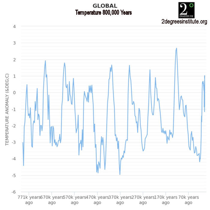
People are seldom told HOW MUCH is the increase of temperatures or that there has been no increase in globally averaged temperature for over 18 years. They are seldom told how miniscule is that increase compared to swings in daily temperatures. They are seldom told about the dangerous effects of government policies on their supply of “base load” energy — the uninterrupted energy that citizens depend on 24/7 — or about the consequences of forced curtailment of industry-wide energy production with its hindrance of production of their and their family’s food, shelter, and clothing. People are, in essence, kept mostly ignorant about the OTHER SIDE of the AGW debate.
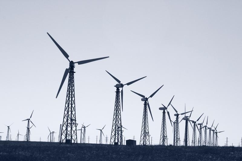
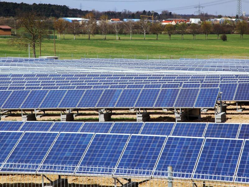
Major scientific organizations — once devoted to the consistent pursuit of understanding the natural world — have compromised their integrity and diverted membership dues in support of some administrators’ AGW agenda. Schools throughout the United States continue to engage in relentless AGW indoctrination of students, from kindergarten through university. Governments worldwide have been appropriating vast sums for “scientific” research, attempting to convince the populace that the use of fossil fuels must be severely curtailed to “save the planet.” Prominent businesses — in league with various politicians who pour ever more citizen earnings into schemes such as ethanol in gasoline, solar panels, and wind turbines — continue to tilt against imaginary threats of AGW. And even religious leaders and organizations have joined in to proclaim such threats. As a consequence, AGW propaganda is proving to be an extraordinary vehicle for the exponential expansion of government power over the lives of its citizens.
Reasoning is hindered by minds frequently in a state of alarm. The object of this website is an attempt to promote a reasoned approach; to let people know of issues pertaining to the other side of the AGW issue and the ways in which it conflicts with the widespread side of AGW alarm (AGWA, for short). In that way it is hoped that all members of society can make informed decisions.
Climate Change News
US ICE Vehicle Phaseout
- 2/1/22 at 07:00 AM

Highlighted Article: Where Fake Science Came From
- 1/27/22 at 07:00 AM

Renewable Transition
- 1/25/22 at 07:00 AM
Highlighted Article: So, What Exactly Is Long-Duration Energy Storage?
- 1/20/22 at 07:00 AM

Gas Generation Phaseout
- 1/18/22 at 07:00 AM
Highlighted Article: A Victim of the Climate Wars: A Warning from the U.K.
- 1/13/22 at 07:00 AM

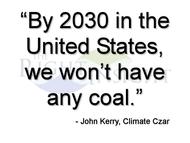
US Coal Phaseout
- 1/11/22 at 07:00 AM
Climate Goals 2022
- 1/4/22 at 07:00 AM

Highlighted Article: Interview: Climate Change – A Different Perspective with Judith Curry: Part II
- 12/30/21 at 07:00 AM

Climate Lessons 2021
- 12/28/21 at 07:00 AM

Highlighted Article: Why so torqued up about Suzuki’s comments? Did you sleep through the first two acts?
- 12/23/21 at 07:00 AM
Coal in His Stocking
- 12/21/21 at 07:00 AM

Highlighted Article: Media Promotes Badly Flawed Science Spreading It Like Wildfire
- 12/16/21 at 07:00 AM
Tipping Points
- 12/14/21 at 07:00 AM
Highlighted Article: The Next Environmental Crisis
- 12/9/21 at 07:00 AM
-
Headlines
Search Headlines-
Stop These Things’ Weekly Round Up: 29 June 2025
- Stop These Things
- June 29, 2025
-
CFACT report: Feds fail to “offset” wind turbine eagle kills
- CFACT
- June 29, 2025
-
The Big Beautiful Bill Torpedoes Big Solar & Big Wind
- Substack
- June 29, 2025
-
The Energy Vibe Shift Is Real
- Energy Bad Boys - Substack
- June 28, 2025
-
Raise a Glass to the Shuttering of Climate.gov
- Watts Up With That
- June 28, 2025
-
Physics First Energy Policy
- Eigen Values - Substack
- June 28, 2025
-
Top Five Climate Change Narratives in the Media
- The Honest Broker - Substack
- June 27, 2025
-
NZW Samizdat: Robbing Peter to pay Paul
- Net Zero Watch
- June 27, 2025
-
UK Pulls Plug on £24 Billion Desert Power Fantasy
- Watts Up With That
- June 27, 2025
-
Cleaner Air, Sunshine & Temperatures
- Not A Lot Of People Know That
- June 27, 2025
-
What is the Point of the UK Met Office?
- Daily Sceptic
- June 27, 2025
-
Climate Change Weekly # 548 — Recent Headlines Prove Wind, Solar Still Aren’t Ready for Prime Time
- The Heartland Institute
- June 26, 2025
-
This battery recycling company is now cleaning up AI data centers
- MIT Technology Review
- June 26, 2025
-
Big Plans in Texas
- Substack
- June 26, 2025
-
Scientists Pitch $117 Trillion Wind-Solar Super Network
- OilPrice.com
- June 26, 2025
-
"Train Wreck": Extreme Measures Being Taken To Battle Biden's 'Green' Energy Grid Crisis
- ZeroHedge
- June 26, 2025
-
The Cat’s Out of the Bag
- Climate Scepticism
- June 26, 2025
-
Wind Power’s Subsidy Sham: Grumet’s Plea Ignores 40 Years of Unreliability
- Watts Up With That
- June 25, 2025
-
Sunnova Goes Bankrupt After Receiving Billions in Green Giveaways
- IER
- June 24, 2025
-
Three Big Projects Offer Hope That Our Energy Nightmare Is Ending
- The Empowerment Alliance
- June 17, 2025
-
-
Scholars Wanted
 The Right Insight is looking for writers who are qualified in our content areas.
