Call or complete the form to contact us for details and to book directly with us
435-425-3414
435-691-4384
888-854-5871 (Toll-free USA)


Contact Owner

*Name
*Email
Phone
Comment
 
Skip to Primary Navigation Skip to Primary Content Skip to Footer Navigation

In the Wake of the News

Sea Level Graphs

The graph below plots global sea level over the past approximately 800,000 years. Note the cyclical nature of sea level over that period. Sea level ranges from a high of +11 meters to a low of -133 meters. The low levels are associated with ice ages.


Global Sea Level 800000 years


The graph below plots global sea level over the past approximately 1000 years. The heavier graph line beginning in approximately 1890 is instrumental data, as opposed to the proxies prior to then. The instrumental data ranges from a low of -2.2 centimeters to +22.4 centimeters. Note that the y-axis in this graph is units of centimeters rather than meters in the graph above. Note also that current sea levels are 10.8 meters lower than the peak level approximately 400,000 years ago.


Global Sea Level 1000 years


The graph below plots the sea level rise since 1880 in millimeters. The total sea level rise over the period is approximately 265 millimeters, or approximately 1.7 millimeters per year. The dark line overlaying the light blue line in the graph plots sea level rise as measured by satellite, while the light blue line is measurements taken by tide gauges.


Sea Level Change 1880-2020


The graph below estimates the effects of the factors which contribute to sea level rise. The satellite data computes an annual sea level rise of approximately 3.3 millimeters per year since the data became available in 1993, or nearly twice the rate of rise measured by the tide gauges. This is a very significant difference which remains unresolved.


Sea Level Satellite Data


However, the graph above contains data from four different satellites, but does not identify the period over which each satellite provided the data, nor does it differentiate the rates of sea level rise provided by each satellite. The graph below prepared by Willis Eschenbach provides this information.


Satellite Sea Level Anomaly


Note that the rates of rise measured by the two earlier satellites are essentially identical, while the two later satellites differ significantly both from the earlier satellites and from each other. It is not yet clear whether the higher rates measured by the more recent satellites reflect a real acceleration in the rate of sea level rise. Regardless, combining the measurements from the four different satellites into a composite graph with an average rate of rise is poor practice.

Global sea level rise is a very difficult phenomenon to measure. Tide gauges are located sparsely along global shorelines. Many of the locations of the tide gauges are subject to subsidence due to erosion, ground water extraction or mineral production. Other locations remain subject to geostatic rebound following the compression imposed by the last ice age. Finally, the seas are never at rest, but rather are subject to tides and to wind-driven ripples, swells and waves as well as thunderstorms and tropical cyclones.


Tags: Sea Level Rise, Sea Level Change

Highlighted Article: Climate Dynamics: The True Control Knob of Climate Change


From: Watts Up With That

By: Jim Steele

Date: March 27, 2021


Climate Dynamics: The True Control Knob of Climate Change


"The earth’s energy equilibrium is determined by the balance between incoming solar radiation versus radiative cooling that emits infrared radiation back to space. Water vapor primarily and CO2 can slow radiative cooling via the greenhouse effect. I am most grateful for the greenhouse effect. Without it the earth’s average temperature would hover near 0°F instead of our currently more livable 59°F. But in addition to any radiative effects, the earth’s global average temperature is determined by a variety of climate dynamics, such as the balance between ocean heat storage and heat ventilation. This is well established as climate scientists attributed the slowdown in 21st century global warming was due to increased ocean heat storage associated with a period of more La Ninas. Warming in the northeast Pacific Ocean, famously known as the blob, was not caused by added heat, but by reduced winds that ventilated less heat than normal. Cloud dynamics are also important. Clouds can warm the nights and cool the days." ...


Climate Dynamics: The True Control Knob of Climate Change


Tags: Highlighted Article

Temperature Graphs


The graph below shows proxy-based global annual temperature anomalies from proxies for the period approximately 800,000 years ago to the present. This graph shows the cyclical nature of global temperatures over the period. The anomalies range from approximately -5° to approximately +2.7°C.The graph below shows proxy-based global annual temperature anomalies from proxies for the period approximately 800,000 years ago to the present. This graph shows the cyclical nature of global temperatures over the period. The anomalies range from approximately -5° to approximately +2.7°C.


Global Temperature 800,000 years


The next graph shows global annual temperature anomaly estimates for approximately the past 1000 years. The heavier graph line at the right-hand end of the graph shows instrumental temperature data beginning in about 1880. The January 2021 anomaly is 0.86°C.


Global Temperature 1000 years


The following graph shows the global surface temperature anomaly records produced by Hadley Center, NASA, NOAA, Berkeley Earth and Cowton & Way. Note that the graph lines are nearly identical after about 1970. These anomaly products agree closely with the anomaly shown in the graph above.


Global Temperature 1850-2019


The graph below shows the entire history of the UAH satellite temperature anomaly record. This graph displays monthly anomaly values and shows the extremely rapid anomaly changes which occur largely as the result of ENSO events.


Temperature UAH Satellite Jan 2021


The graph below focuses on a very interesting aspect of the temperature anomaly data. It shows that the anomaly trend in the lowest annual minimum temperature anomaly is increasing more than twice as rapidly as the highest annual maximum temperature anomaly. This suggests that the data is affected by the Urban Heat Island (UHI) effect, which causes the high temperature anomaly to be muted by the absorption of heat by urban infrastructure which is then released at night, offsetting a portion of the temperature anomaly drop at night. This characteristic exhibits for each of the countries studied, with the exception of Mexico.


Temperature Anomalies and Extremes 1900-2012


The following graph provides often ignored perspective regarding the increasing temperature anomalies. The orange line is a plot of the increasing temperature in a mid-latitude city. However, while the first four graphs above use compressed y axes to emphasize the increasing temperature anomalies, this graph plots the increasing temperature against a “y” axis which represents the entire range of temperatures experienced in that city, including the record high and record low temperatures. Clearly, the increasing temperature resulting from recent global warming is trivial when viewed from this broader perspective.

The red band on the graph is the typical range of summer daily temperatures in the warmest month of the year, while the blue band is the typical range of daily temperatures in the coldest month of the year. Compared with average daily temperature changes of approximately 20°F throughout the year, an increase in average annual temperature of approximately 1.6°F does not appear to represent a “crisis” compared with a historical range of temperatures of 120+°F, especially when two thirds of the increase is reflected in warmer low temperatures.


Temperature-Average Annual Global 1880-2015


It is difficult to imagine reporting either global average temperature or global average temperature anomalies to two decimal place precision when sea surface temperature (71% of earth’s surface area) is not known and the various measures of sea surface temperature display differing rates and directions of change, as shown below.


Temperature-Mixed Layer or SST 2000-2019


Tags: Global Temperature, Temperature Record, Temperature Anomaly

CO2 Graphs

The graphs below show atmospheric CO2 levels over the past 800,000 years and the past 1020 years. The longer term graph illustrates the cyclical nature of atmospheric CO2 concentrations, varying from a low of approximately 173 ppm to a high of approximately 300 ppm until very recently. The shorter term graph shows the more rapid rise, beginning in approximately 1910. The heavier graph line beginning in approximately 1960 shows the instrumented data from the Mauna Loa Observatory in Hawaii. The earlier period concentrations in the graph are based on proxies.


Global CO2 Levels 800000 years


Global CO2 Levels 1000 years


The next graph shows measured data collected in Europe from 1800 until 1960, when the Mauna Loa data became available. This graph clearly shows CO2 concentrations above current levels during the period from approximately 1800 until 1825. These measurements were performed by chemical analysis and their accuracy is disputed, though they should have better resolution than the proxy data shown in the graphs above.


CO2 Levels 1800-1960


The following graph displays the Mauna Loa data beginning just prior to 1960. This data clearly shows the changes in CO2 concentration on a seasonal basis, as well as the longer-term increase to approximately 415 ppm through 2020.


CO2 Levels Mauna Loa

Atmospheric CO2 concentration is considered important by the consensed climate science community, many of whom believe it is the “control knob” for global temperatures. However, as shown in the graph below, the effect of incremental CO2 in the atmosphere decreases logarithmically as the concentration increases.


This result was recently confirmed as the result of research by Happer and Wijngaarden, who studied the infrared absorption spectra for CO2 spectral line by spectral line. They concluded that the absorption potential of CO2 in the atmosphere is virtually ”saturated”, in the sense that additional CO2 would produce virtually no additional warming.


CO2 Heating Effect


The results of the Happer and Wijngaarden study are consistent with the numerous research results shown in the graph below, which suggest that the sensitivity of the climate to additional CO2 is at or below the low end of the range of sensitivities assumed by the IPCC.

It is clear from the graphs above that atmospheric CO2 concentrations have increased in the period since about 1950. Global annual CO2 emissions continue to increase, driven largely by increasing fossil energy consumption in the developing nations of Asia and Africa. However, the research of Happer and Winjgaarden suggests that this increase should have minimal effect on atmospheric heating and global temperatures.


Tags: CO2 Emissions

Highlighted Article: The Water Planet Earth And Its Climate


From: Watts Up With That

By: Boris Winterhalter

Date: March 16, 2021


The Water Planet Earth And Its Climate


Introduction

Many years ago I happened to read a paper by Willis Eschenbach introducing his Water Thermostat. I have forgotten the essence of his paper, but the name stuck with me for years. Now years later and having retired from my normal marine geological activity at the Geological Survey of Finland in 2002, I have been able to dig deeper into the IPCC storyline of manmade global warming. The fact is that my view of the story does not meet ends with the official IPCC storyline where carbon dioxide, instead of being the source of life, is assumed to be the master culprit behind the slight warming of our planet for example since the end of the Little Ice Age 150 years ago. It is said that the warming is caused by the fast developing industrial revolution, luckily learning to exploit fossil fuels, and thus improving human living standards.

Yes! Carbon dioxide has been coined as an evil gas, a pollutant by the US Environ-mental Protection Agency (EPA), warming the atmosphere to catastrophic levels, inducing floods, droughts, super hurricanes and even the “end of humanity”? The ghastly thing is that the IPCC climate narratives have been successfully targeted to scare people in all parts of our wonderful planet with imminent danger due to increasing levels of emissions of CO2 which, as I mentioned above, is in reality, together with water, simply the “must food” for plants, thus also for all life on Earth.

I should point out that from the first IPCC climate assessment report published in 1990, the scare tactics in all four IPCC follow-up reports up to the fifth AR5 WGI science basis report, the scare propaganda has every time intensified. Probably the 6th report, soon to be published, will be close to doomsday propaganda.

In my talk I will try to paint a picture of our planet and how come it has been able to sustain vivid life forms for over half a billion years and this I will do without those complex climate models assumed to be able to mimic nature. But before that, there was recently this interesting link by Professor Toby Tyrrell: https://inews.co.uk/news/planet-earth-has-remained-habitable-for-billions-of-years-because-of-good-luck-8153366. Tyrell a specialist in Earth system science highlighting results of a recent study, published in the Nature Journal Communications Earth and Environment, suggested that “chance” is a major factor in determining whether planets, such as Earth, can continue to nurture life over billions of years. Tyrrell comments: “A continuously stable and habitable climate on Earth is quite puzzling. Our neighbors, Mars and Venus, do not have habitable temperatures, even though Mars probably once did also have water.” Tyrrell concludes: “Pure chance is the reason that Planet Earth has stayed habitable for billions of years.”

I personally do not think that good luck has anything to do with habitability. The fact remains that the conditions for life to evolve have just been plain suitable, i.e. just a few prerequisites are needed:

So what makes Earth so special? Five major reasons!" ...


The Water Planet Earth And Its Climate


Tags: Highlighted Article

Key Climate Graphs

Graphs are a powerful tool for illustrating, explaining and summarizing technical information. They are frequently used in climate science to provide historical information and perspective on various aspects of weather, climate and climate change. They are also used to illustrate potential future changes in aspects of climate based on climate models.

The most important aspects of weather in the context of climate and climate change are related to recurring events such as El Nino and La Nina (ENSO), tropical cyclones, floods, droughts, heat and cold waves, tornadoes and wildfires. The extent of the historical records of these various weather events varies. The records are also affected in recent years by the availability of satellites which can detect smaller tornadoes and tropical cyclones which would have been more difficult to detect previously.

The most important aspects of climate and climate change are related to longer term changes (30+ years), including atmospheric CO2 emissions rates and cumulative concentrations, global temperatures and temperature anomalies, global sea level and rate of sea level rise, and model projections of future changes in these climate measures.

One of the primary requirements of good scientific graphical presentations is that the graph cover the entire period for which data is available so that the historical context is available to the users. It is also important that any changes in the sources or methods of collection of the data be explicitly noted. The most significant of these sources and methods issues are the change from proxies to instrumental data and changes in the instruments used to collect the instrumental data.

The following series of commentaries will present several of the most important graphs illustrating each of these climate and weather issues.

    Carbon Dioxide Emissions and Atmospheric Concentration
    Global Temperature
    Sea Level and Sea Level Rise
    Climate Models
    Weather Events

The graphs have been selected to provide perspective on the climate changes and weather events occurring currently. Each graph will be accompanied by observations on its significance and comments on its important characteristics. Note that none of the various line graphs display uncertainty bands, though there is significant uncertainty regarding the graphed values, especially where the graphs include proxy information. The information presented in the bar graphs is typically based on counted observations and thus less subject to uncertainty, though not completely immune from it.


Tags: Climate History, Climate Change Debate, Climate Science

Highlighted Article: A Short History of CLIMATE ALARM!


From: GWPF

By: Paul Homewood

Date: March 2021


A Short History of CLIMATE ALARM!


"1970s Ice Age scare

Numerous reports in the 1970s reflected concern that the Earth was heading towards a new ice age. These are nowadays often dismissed as mere newspaper gossip, but they were far more than that.

Some scientists forecast a full ice age, for instance NASA’s Dr Rasool, who said that air pollution would cause a drop in temperatures of six degrees. Such predictions were of the more extreme variety, but there was widespread acceptance amongst climate scientists that global temperatures had fallen sharply since the 1940s, and that this trend was likely to continue.

The US government was so concerned about events that it set up a Subcommittee on Climate Change in 1974, in turn leading to
the US Climate Program in the same year and the subsequent formation of the Climate Analysis Center, designed to monitor and predict climate change. This was the predecessor to today’s NCEI, the National Centers for Environmental Information run by the US Department of Commerce.

Needless to say, the cooling trend ended soon after the subcommittee was set up, and warming resumed.


If the cold does not get you, the heat will!

In the 1980s, the cooling trend reversed, and it did not take long for forecasts of apocalypse to re-emerge, but this time based on the idea of a hothouse planet. In 1989, Noel Brown, director of the New York office of the UN Environment Program did not hold back, warning us that:

  • entire nations could be wiped off the face of the Earth by rising sea levels if the global warming trend was not reversed by the year 2000;
  • coastal flooding and crop failures would create an exodus of ‘eco-refugees’;
  • sea levels would rise by up to three feet;
  • coastal regions would be inundated – one-sixth of Bangladesh could be flooded, displacing a quarter of its 90 million people, and a fifth of Egypt’s arable land in the Nile Delta would be flooded, cutting off its food supply;
  • it would cost the United States at least $100 billion to protect its east coast alone;
  • shifting climate patterns would bring back the Dust Bowl conditions of the 1930s to Canadian and US wheat lands.
  • the most conservative scientific estimate was that the Earth’s temperature would rise from 1 to 7 degrees over the following 30 years.

Well, the year 2000 came and went, emissions of greenhouse gases carried on climbing, and global temperatures rose by a modest 0.4°C. Needless to say, none of Brown’s cataclysms came about either, as later chapters will reveal.


X-years to save the planet ..."


A Short History of CLIMATE ALARM!


Tags: Highlighted Article

$2 Trillion Climate Plan

President Biden proposed a $2 trillion climate and energy plan during his campaign. He has now begun implementation of that plan, which would provide the funding over his first term in office. The funding would be primarily in the form of incentives to encourage investments in clean energy facilities and equipment and in energy efficiency improvements.

The discussion of this and similar plans rarely includes any mention of the level of private investment and cost required to achieve the plan goals and objectives, or the deadweight losses resulting from replacement of functional facilities and equipment before the ends of their useful lives.

One specific element of the Biden plan is the installation of 500,000 electric vehicle charging stations. This effort would involve acquisition or repurposing of land or building space for installation of the charging equipment, parking spaces for the recharging vehicles and acquisition of additional utility electric service capacity. Depending on the location of the facility, the electric distribution grid might require reinforcement to provide the incremental electric energy. This element of the program would also require some legislative or regulatory requirement for the purchase of large numbers of electric vehicles, probably with continued federal incentive funding to offset a portion of the incremental cost of the vehicles. However, the bulk of the funding for these activities would be private capital.

Another specific element of the program is the upgrading of 4 million buildings and weatherizing 2 million homes. These are both expensive efforts. The building upgrades would be predominantly to commercial and institutional buildings and would likely require substantial owner investment. The home weatherization effort would likely be targeted at low-income homeowners and would probably require a lower percentage of owner investment. Considering the Administration’s intent to terminate fossil fuel use in the US by 2050, the building upgrades would likely require replacement of natural gas, propane and oil heating systems and water heaters with electric equipment, which again might require acquisition of additional electric utility service capacity and perhaps distribution system upgrades as well.

Arguably the most ambitious element of the plan is accelerating the utility industry transition to renewable sources of generation, which the Administration intends to have completed by 2035. This effort would probably require continuation and expansion of federal incentive programs for wind and solar installations, combined with regulatory or legislative requirements for utilities to provide service to these new generating facilities as well as priority positioning in the supply order. As these new facilities come online, they will begin to render some existing utility generation facilities no longer “used and useful”, causing them to be removed from the utilities’ rate bases and abandoned, even though they are still functional.

The abandonment of functional fossil fuel generating stations would not only be a deadweight loss but would also begin rendering the fossil energy resources owned by the utilities and their suppliers as deadweight losses, since the powerplants they supplied were no longer operating.

President Biden’s nominee for Secretary of Commerce has already been quoted as saying that “we need funds for the climate agenda”, though the nature and magnitude of the specific taxes is yet to be determined.


Tags: Electric Power Generation, Renewable Energy

China / Paris Accords

China is the most populated nation on earth. China also has the second largest economy among the nations of the earth. China is a signatory to the Paris Accords, which recognize it as a developing nation. China is also earth’s largest CO2 emitter, producing more than 28% of earth’s anthropogenic CO2 emissions. These factors make China a major force in the global effort to reduce anthropogenic CO2 emissions under the Paris Accords.

Prior to COP 21, nations were asked to submit Intended Nationally Determined Contributions (INDCs) toward the COP objective of reducing global carbon emissions. China’s INDC is summarized as follows:

  • To achieve the peaking of carbon dioxide emissions around 2030 and making best efforts to peak early;
  • To lower carbon dioxide emissions per unit of GDP by 60% to 65% from the 2005 level;
  • To increase the share of non-fossil fuels in primary energy consumption to around 20%; and
  • To increase the forest stock volume by around 4.5billion cubic meters from the 2005 level.

China is clearly making an effort to peak annual CO2 emissions early, as shown in the graphs below. However, they have been far less successful in increasing the share of non-fossil “fuels” in primary energy consumption.


China Primary Energy


Carbon Dioxide Emissions


China currently plans to build an additional 250 GW of coal generation, a 25% increase over its current coal generating fleet. The increased CO2 emissions from these plants would be expected to increase China’s share of global annual CO2 emissions beyond 30%, even with the expected growth of coal generation in other nations.

China President Xi Jinping has announced that China would be “carbon neutral” by 2060, though the new coal plants currently under construction or planned would be expected to have operating lives of 40-60 years, so plants completed in 2030 would be expected to operate until 2070-2090.

China has also committed more than $20 billion for the construction of coal generating stations in other countries, including Bangladesh, Pakistan, Indonesia, Vietnam, South Africa and Zimbabwe. These power generating facilities would further increase global CO2 emissions.

The United Nations, through UNFCCC, is quick to excuse China’s aggressive increases in annual CO2 emissions on the ground of “Environmental Justice”, essentially accepting the Chinese position that its economic growth is a greater current imperative than reducing CO2 emissions in the interest of averting a “climate crisis”, or a “climate emergency” or an “existential threat”. Apparently only CO2 emissions from developed countries would contribute to a “climate crisis”.

The UNFCCC and the developing nations appear willing, even anxious, to watch the developed countries commit economic suicide while they focus on accelerating their economic development.

We are frequently told of the environmental benefits and economic superiority of renewable energy sources, though the developing nations appear to disregard renewables in favor of coal, oil and natural gas. The developing countries are clearly making major investments in fossil fueled electric generation to support their future economic growth, while the developed countries focus on renewables as the path to their economic decay.

Something seems wrong about this picture.

Tags: Paris Agreement

Highlighted Article: IMPACTS OF CLIMATE CHANGE - PERCEPTION AND REALITY


From: GWPF

By: Indur M. Goklany

Date: February 2021


IMPACTS OF CLIMATE CHANGE - PERCEPTION AND REALITY


1. The standard narrative

The standard narrative regarding climate change, as represented by the quotes on the opposite page, from some of the world’s most influential people and institutions, is that climate change is already increasing the frequency and intensity of extreme weather events (EWEs) and wildfires, reducing available water and crop yields, increasing diseases, hunger, poverty and human mortality, and reducing productivity of the biosphere and the habitat available for species. It is claimed that these and other climate change impacts are diminishing human and environmental wellbeing, and will reduce them further unless ‘drastic measures to achieve as quickly as possible zero net greenhouse gas emissions’ are taken.

This paper considers whether data on climate-sensitive indicators are consistent with this narrative. Specifically, it examines empirical trends in extreme events, wildfires, water availability, vector-borne diseases, and some indicators of human and environmental wellbeing, such as economic development, poverty rates, life expectancy, biological productivity, and cropland per capita. Since climate change is a global phenomenon, the paper focuses primarily on indicators at the global scale. But it will also examine trends for the US, to a lesser extent China and India (which together comprise over a third of humanity), and, where readily available, aggregated data from developing or low-income countries. However,one should recognise that the existence of a trend in one country (or section of the globe) is not indicative of a global trend.

Moreover, because climate change should not be confused with fluctuations in the weather, the focus will be on long-term trends. Ideally, the temporal record examined should be long enough to, firstly, capture a change in climate. Climate is often defined in terms of 30-year averages. Thus, it should be long enough to define at least two non-overlapping 30-year periods. Secondly, it should also encompass at least one, if not more, full periods encompassing any significant atmospheric or oceanic cycle(s) that could significantly affect the phenomenon for the region under examination. For example, the Atlantic Multidecadal Oscillation, which, it has been theorised, can affect precipitation and droughts on both sides of the Atlantic and hurricane activity in the North Atlantic Basin, has a 60–80 year period.10 Thus, ideally, the temporal record for determining trends for that region should be long enough to span a few of these periods.

Unless explicitly noted, I will use ‘climate change’ synonymously with ‘greenhouse gas induced climate change’.


IMPACTS OF CLIMATE CHANGE - PERCEPTION AND REALITY


Tags: Highlighted Article

Misinformation Commission

The past several years have seen the appearance and proliferation of “fact checkers”, some of which are more like “fake checkers” driven by their founders positions on current issues. This evolved into organizations including Facebook, Twitter and Google blocking subscriber content and then banning individuals and organizations from using their services. However, two Duke University professors have now proposed establishment of a federal, “non-partisan” Misinformation Commission, though there is no assurance that such a Commission would be expert or objective. The suggested federal Commission is reminiscent of the Ministry of Truth in George Orwell’s 1984, which was also responsible for the ongoing revision of history.

Climate change would likely be a priority focus of the Commission, since charges of misinformation and the use of epithets such as “denier” and “anti-science” have been commonly aimed at skeptical scientists and politicians by climate change alarmists in the environmental movement, numerous politicians and bureaucrats and by some members of the consensed climate change community. There is even a website which focuses exclusively on exposing and berating scientists and others skeptical of the climate alarmist narrative.

The following are some examples of climate misinformation to assist the Commission.

1. Any statement that climate science is “settled science”, since there are numerous aspects of climate and climate change which are not well understood, including climate sensitivity and atmospheric feedbacks.

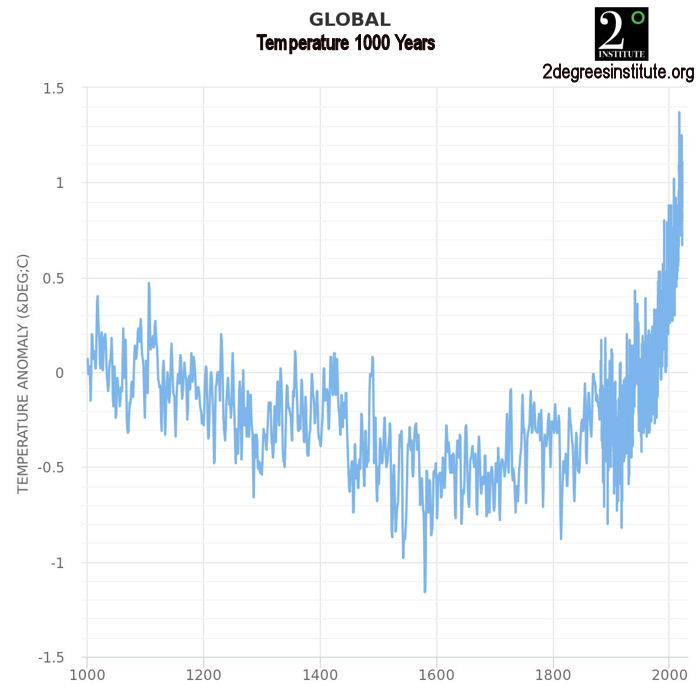
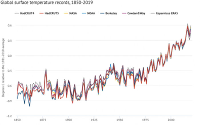
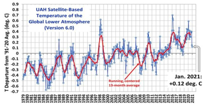
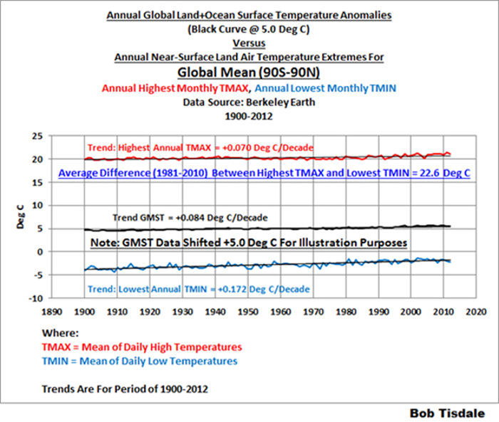
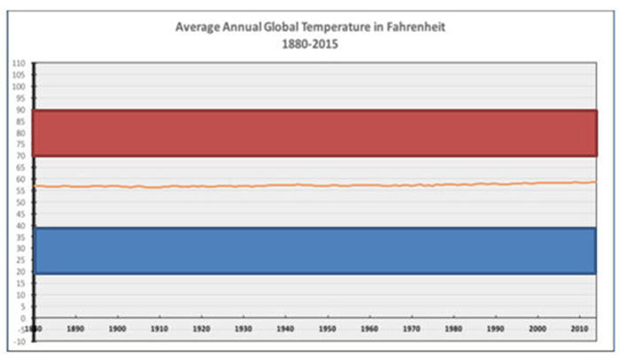
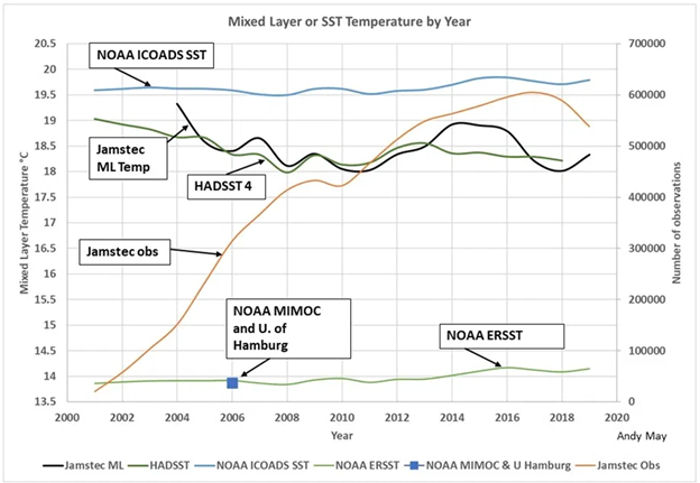
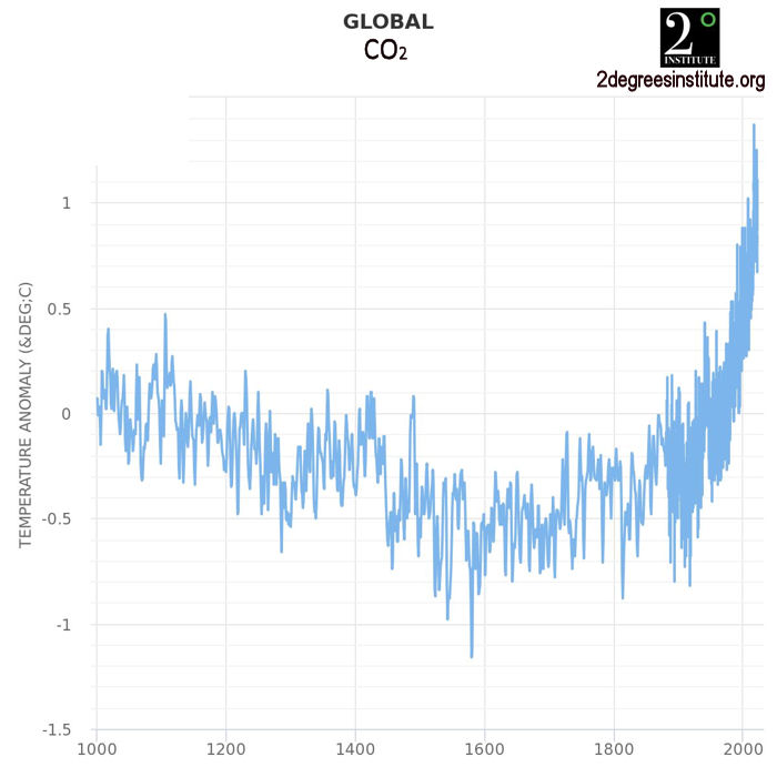
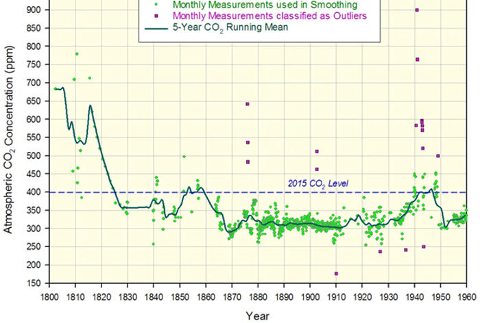
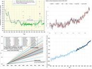
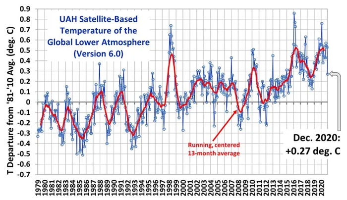
2. Any statement that global near-surface temperature anomalies have changed by an increment of one or more hundredths of a degree centigrade, since: the measurements are not made with that precision; many of the measurements are inaccurate and are “adjusted” to correct them; and, many areas of the globe are sparsely measured or unmeasured.

3. Statements that climate models can accurately project or predict future climate conditions, since the models were not able to accurately predict current conditions when they were “tuned” to previous temperature history and none of the models has been verified.

4. Statements that weather events have become more frequent or more intense as the result of climate change, since changes in weather event frequency and intensity have been neutral or negative.

5. Statements that weather events will become more frequent or more intense in the future as the result of some climate change contribution, since these statements are based on unverified attribution models.

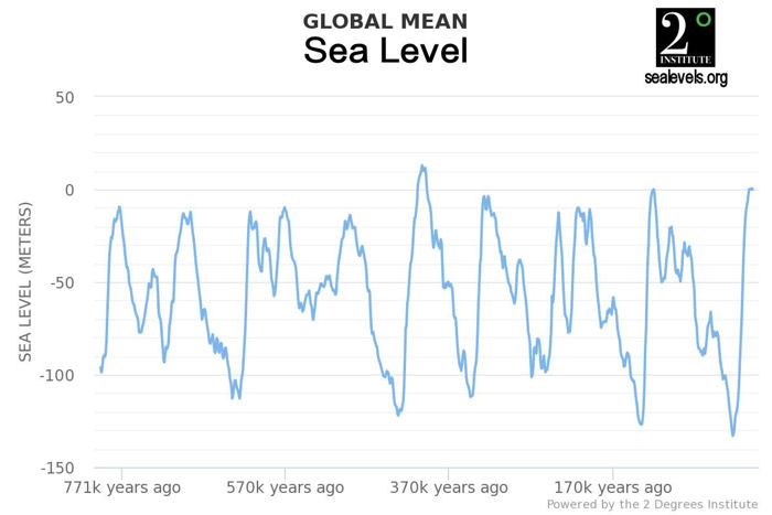
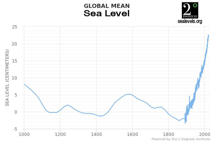
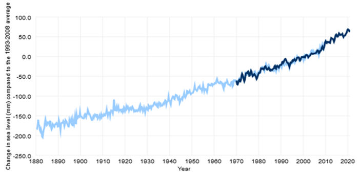
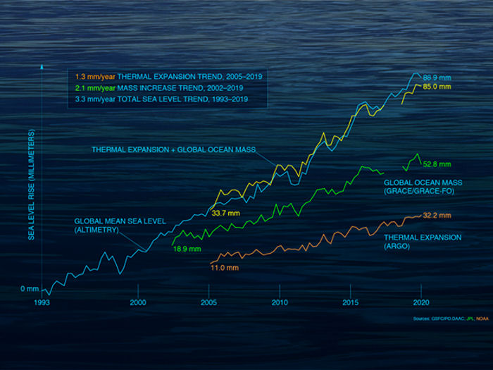
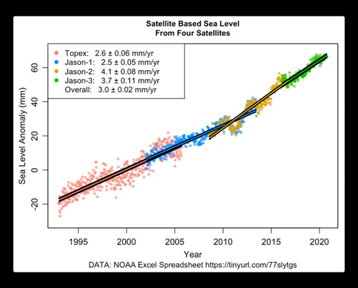
6. Statements that the rate of sea level rise has doubled, or that the rate of sea level rise is increasing, based on satellite sea level measurements, since the differences between the satellite sea level measurements and the tide gauge measurements have not been resolved; and, since the purported change in the rate of increase in less than the measurement uncertainty in the satellite measurements.

7. Statements that wildfires have increased as the result of climate change, since satellite data refutes these statements.

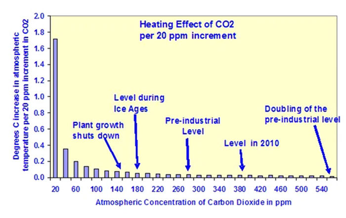
8. Statements that climate change is interfering with crop production, since crop production has increased globally and laboratory experiments confirm that increased carbon dioxide concentrations enhance plant growth and the efficiency of plant water usage.

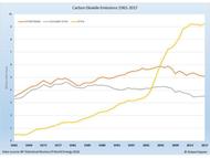
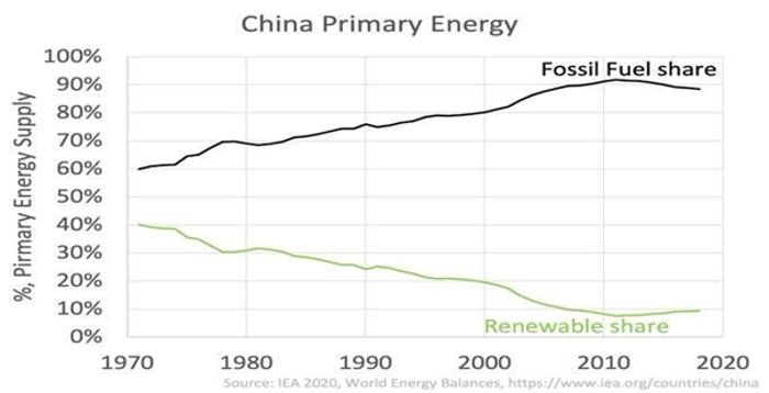
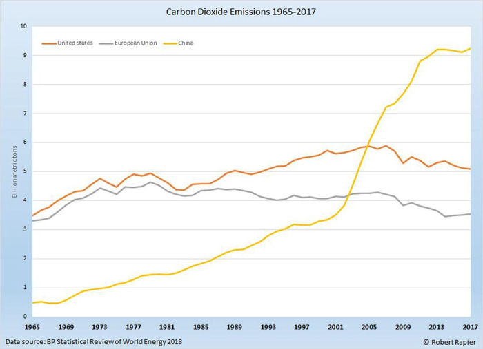
9. Statements that there is a climate “crisis”, or “emergency” or that climate change represents an “existential threat”. These statements are not supported by the IPCC reports nor by the actions of numerous national governments which are aggressively increasing their carbon dioxide emissions to expand their economies.

The climate change which has occurred and is currently occurring has produced net positive effects across the globe. There is no indication that this will change in the foreseeable future.

“The whole aim of practical politics is to keep the populace alarmed (and hence clamorous to be led to safety) by menacing it with an endless series of hobgoblins, all of them imaginary.”, H. L. Mencken


Tags: Climate Change Debate

Highlighted Article: ‘97% consensus is a convenient fiction’ – Meteorologist Joe D’Aleo rebuts the 11 most common climate claims


From: Climate Depot

By: Joseph S. D’Aleo, CCM

Date: February 5, 2021


‘97% consensus is a convenient fiction’ – Meteorologist Joe D’Aleo rebuts the 11 most common climate claims


Climate Claim Fact Checks

"Below are a series of fact checks of the 11 most common climate claims such as those made in the recently released Fourth National Climate Assessment Report.[2] The authors of these reviews are all recognized experts in the relevant fields.

For each claim, a summary of the relevant rebuttal is provided below along with a link to the full text of the rebuttal, which includes the names and the credentials of the authors of each rebuttal.

See Impacts of Climate Change Perception and Reality by Indur M. Goklany here.

Heat Waves – have been decreasing since the 1930s in the U.S. and globally.

Hurricanes – the decade just ended as the second quietest for landfalling. hurricanes and landfalling major hurricanes in the U.S since the 1850s. 2020 saw a record 30 named storms and many Gulf impacts like the quiet solar periods in the late 1800s and this century, but the AC index ranked 13th highest. See 2020 Update showing similarities to late 1800s here and global contrasts here.

Tornadoes – the number of strong tornadoes has declined over the last half-century. More active months occur when unseasonable cold spring patterns are present." ...


‘97% consensus is a convenient fiction’ – Meteorologist Joe D’Aleo rebuts the 11 most common climate claims


Tags: Highlighted Article

Satellite Temperatures


University of Alabama Huntsville (UAH) has released their analysis of lower atmosphere temperature anomalies through December 2020. The current graph is shown below.


UAH Satellite- Based Temperature of the Global Lower Atmosphere (Version 6.0)


The temperature anomaly decreased by 0.26°C in December 2020, from 0.53°C in November. Dr. Roy Spencer noted that 2020 was the second warmest year in the 42-year satellite record at 0.49°C, compared to 0.53°C in 2016, which was a super El Nino year. The peak monthly anomaly in 2020 was 0.75°C in February, marking the peak of the 2019/2020 El Nino, comparable to the peak temperature in 1998, which was also a super El Nino year.

Dr. Spencer believes that the rapid drop in the anomaly in December marked the beginning of the impact of the current La Nina, which began in the fall of 2020. NOAA expects the current La Nina to persist through at least early Spring and perhaps through the Spring of 2021. It remains to be seen how strong the current La Nina will become, but Southern California Weather Force has issued a super La Nina warning for 2021, projecting the strongest La Nina in recorded history.

The graph below shows the ENSO index values from 1990 – 2020. Note the super El Nino events in 1997/1998 and 2015/2016. Also note that there has not been a very strong or super La Nina during this period. The current La Nina was approaching strong at the end of 2020.


Oceanic Nino Index (ONI) - 1990-present


Note that ENSO events are not climate events, because of their short duration, but rather weather events. However, both El Nino and La Nina events can have major impacts on global temperatures, as shown in the UAH graph of lower atmosphere temperatures. Note also that, while temperature anomalies returned to pre-El Nino levels after the 1997/1998 and 2009/2010 El Nino events, they did not do so after the 2015/2016 super El Nino. In that case, temperature anomalies remained approximately 0.25°C warmer. There is no basis on which to estimate how long it might take for this residual heat to dissipate if it does.

The Pacific Ocean experienced a Great Pacific Climate Shift in 1977, when the Pacific Decadal Oscillation shifted from its cold phase to its warm phase. It appears that the Pacific Ocean might be in the process of shifting back to its cold stage with the start of the current La Nina. The warm phase of the PDO is characterized by more El Nino events than La Nina events, which would tend to leave residual heat from the El Nino events. The cold phase of the PDO is characterized by more La Nina events, which should tend to reduce or remove the residual heat left by the more frequent and stronger El Nino events during the warm phase.

The Great Pacific Climate Shift began before the satellite era, so it is not captured in the UAH graph above. However, it appears that the residual heat remaining after the 1997/1998 and 2015/2016 El Nino events was captured by the UAH anomaly measurements. It will be interesting to see whether the PDO cold mode shift and the current La Nina will remove some or all of the residual heat.


Tags: Global Temperature, Temperature Record, Temperature Anomaly
Search Older Blog Posts